Today’s post is a bit of a departure from the norm. Instead of handing out sage advice for you, I’d like to ask your opinion.
As readers on my Very Special Email List know,* my book, Less Toxic Living: How to Reduce Your Everyday Exposure to Toxic Chemicals – An Introduction For Families is nearly ready for release.
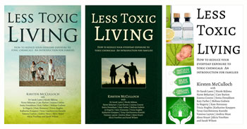
I am very excited to have three different cover concepts to choose from. You can see the one on the right is less well developed (the text spacing isn’t quite right, and I don’t think a purely white background works), but it’s a concept.
I’d love to know which one you think is best – which one attracts you the most? You can click on the covers to enlarge for a better idea. Will you leave a comment and tell me your thoughts?
___________________________
*Unless they only joined in the past week or so.
Linking up with Jess’s IBOT as usual 🙂
35 thoughts on “Which Cover Do You Like Best for Less Toxic Living?”
Comments are closed.


Hi Kirsten,
I love the first one. It’s fresh and lively. The second is ok, but much sterner. And the third is too complicated and fussy for my taste, with unhappy proportions. Also, the white background makes it feel too cold.
My two cents.
Congratulations on gathering together these contributions in book form!
Rosee
Thanks Rosee! I’ve had a couple of friends weigh in on FB too, and now officially have one vote for each 🙂
I like the first one too, or the second one if there was a grad on the dark green background like the grad on the first one.
I like the one on the right, but maybe a light green border around the white to make it stand out? Then my next favourite is the one on the left – it’s the lighter colours that draw me in 🙂 Good luck
The first one for me. Middle second and right side last. In saying that they are all good but if I had to put them in order…..
I like the one on the left the best, but the one on the far right also appeals to me too. Best of luck xx
First one for me, followed by the third and not the middle one at all. Too dark and foreboding! People will read if it looks more positive. Good luck and well done!
I love the idea of the third, but it needs polishing. I like Emily’s suggestion of the border. The pics on the side really appeal to me.
The one on the left is great too.
Have we been a help at all? Or too many opinions now? 🙂
Haha! Lots of opinions is great Jess. I have got some really good ideas from y’all!
I like the left one the most. Though the one on the right is worth tweaking a bit more if you don’t love the other two.
How exciting for you as well!
The one on the left! It has a peacefullness about it and suggests, Nature or Natural. I agree with other post, the one on the right is busy to me.
Good LucK!
While I’m beta reading. 🙂 The first one!
I like the one on the left and the one on the right, the one on my right happens to be my favourite and the one i’m drawn to the most.
I like the one on the right as to me it actually relates to what the book is about. But I agree with comments above that it needs polishing. I like the layout of the ones on the left and centre – it breaks up the wording and makes it seem less…wordy than the one on the right (does that make sense?). Perhaps you could tweak it with the pictures from the third but with the layout of the other two? I don’t know how you are going to decide with all the suggestions and opinions – good luck!
Great suggestion Murra Mumma – I think that might be the way to go 🙂
Hi Kirsten,
I like the right one, because it is fresh and clean. Not wishy washy backgrounds or the dark coloured one that looks too depressing.
1. The font is not great… clean modern font with lighter lines, perhaps.
2. The bottom two pics are clip art and it clashes with the top two pics that are real photos. Make them all real photos, perhaps with some orange colour for liveliness.
I am a graphic artist and that is my scoop on it…. cheers
The black I associate with toxicity, so that one jars on me. I like the one on the right, the pictures call to mind purity more than the family on the beach to me. But maybe the background could have some subtle patterning instead of just white.
I like the first one best.
I prefer the concept of the third one, although it needs work on the layout. The first two are too self-helpy, psychology looking to me. The pictures don’t convey what the book is about.
I Iove the 3rd cover. It’s fresh, clean, and inviting.
ok–I’m really no help! I love the colors in the first one, I LOVE shadow shots and in the third cover I love the hands holding the house!
I’m hopeless!
I love the first one
Hello!
I think the third one!mit really stands out and says family love and care! Definatly NOT the second one its too dark and bleak….
Love Gabs xx
I like the third one …
I always go by first impression. . .the second cover caught my eye first, wording was also easier to read at first glance!!!
Definitely the first one for me. Good luck with your book!
The one on the left caught my eye, the middle one was very austere, and the one on the right was far too ‘busy’, I’d dismiss that one as ‘rubbish’….
I like the one on the left.
Definitly the first one 🙂
Definitely the first one!
I like the first one -it seems to be the most eye-catching.
I like the left one because it is light, but I prefer the photo in the middle one.
The right hand one I would completely pass on a shelf if I saw it as it is too wordy for a cover. I realise it is the same information, but looks like more. The pictures are good and would be fine on another background colour with smaller wording maybe.
Thank you all so much!
I’ve been absolutely blown away by the feedback you all have given me (here, G+, Fb and by email), and got some really good ideas of how to tweak. So fascinating that there’s such a wide variety of very definite likes and dislikes!
I don’t like the one on the left, too hippish for me. I do like the right one, but agree it looks too wordy at the moment.
Thanks Jess 🙂